
In creating my personal branding suite, I wanted to develop a visual identity that feels true to my personality while also presenting me as a polished, professional candidate in the PR field. My designs focus on clarity, simplicity, and intentional use of color, specifically a range of pinks and blues that reflect my upbeat, encouraging, and confident style. I paired these colors with clean, modern typography to keep the emphasis on my logos, imagery, and key information.
Each element of the suite, including my brand kit, visual biography, website banner, LinkedIn header, business cards, and email signature, was crafted to work cohesively while highlighting different aspects of my background. The visual biography incorporates meaningful photos from my leadership roles, campus involvement, and community experiences, helping viewers quickly understand who I am and what I value.
Overall, this branding suite represents a balance between creativity and professionalism. It captures my personal style while remaining adaptable for future career opportunities, giving employers a clear and authentic introduction to my brand.
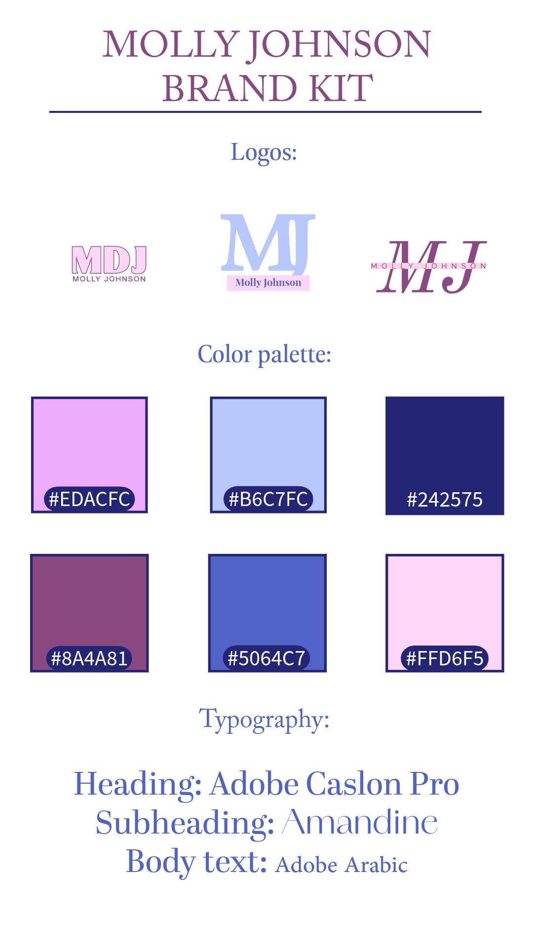
Brand Kit
My brand kit sets the tone for my personal identity through a cohesive color palette of pinks and blues, clean typography, and simple logo variations. These choices reflect my positive, creative style while maintaining a professional look. The kit serves as the foundation for all other elements in my branding suite, ensuring consistency and a clear visual identity.
LinkedIn Header
My LinkedIn header features a simple, professional design that highlights my personal branding while keeping the focus on key information. The color palette and typography align with my overall brand, and my logo is placed on the right to create balance with the platform’s profile icon on the left. This layout ensures a polished, cohesive look that reflects my style and professionalism.


Website Banner
My website banner uses a clean, minimal layout featuring my logo alongside a simple navigation menu. I introduced a deeper pink shade to add contrast and visual interest while still aligning with my overall brand palette. The design keeps the header professional, easy to navigate, and consistent with the rest of my branding suite.
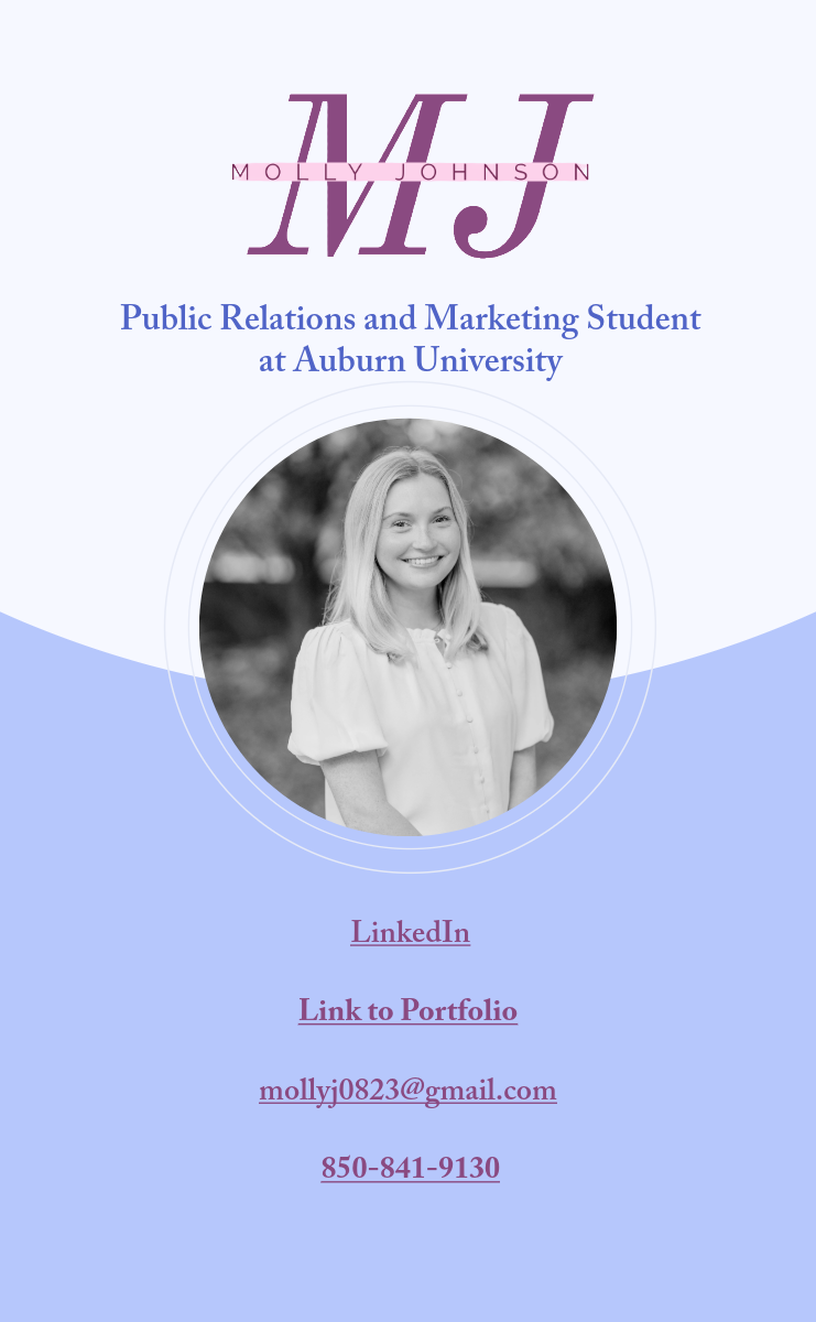
Digital Business Card
My digital business card is designed in a LinkTree-style layout that makes my most important information easy to access at a glance. It features my headshot for a personal touch, my logo for brand recognition, and direct links to my website, email, and social platforms. The clean design and simplified color palette keep the focus on navigation, creating a modern and user-friendly introduction to my personal brand.

QR Code to Digital Business Card
This QR code leads directly to my digital business card. This can be used for employers and recruiters looking for easy access to my links.
Traditional Business Card
Although the design is very simple, my traditional business card has all necessary contact information for me. It directly links my LinkedIn and includes my branding colors and logo.